Project Information
DI Thomas Fußenegger
DI Stefan Hiebeler
Daniela Wache M.Sc.
Florian Schwender M.A.
Praktikant: Mathis Zondler
Client
Stadt Überlingen
Location
Überlingen (D)
Competition
2018
Rights
Text Hermann Kaufmann + Partner ZT GmbH,
Translation Bronwen Rolls
Image Hermann Kaufmann + Partner ZT GmbH
- Outside Facilities Planning
DI Markus Cukrowicz, Winterthur
Gastronomy pavilion Uferpark West, Überlingen
1st place
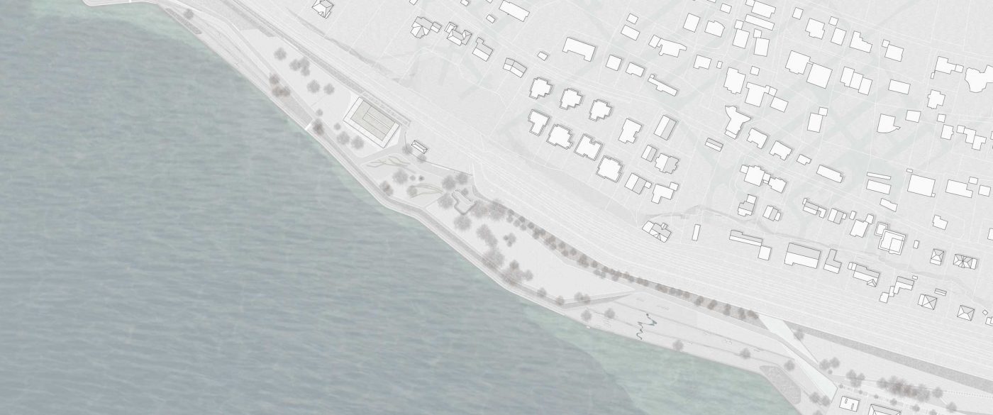
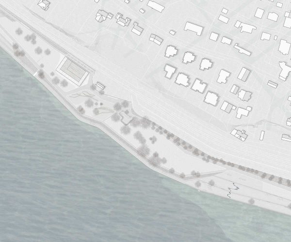
The restaurant pavilion is designed to create a striking addition to the newly created water park. It serves as a contact point, with service functions for park visitors and users of the adjacent playground. It is also an important service area along the busy Lake Constance cycle path. Due to its location as a “house on the lake”, the gastronomic pavilion is also an attractive destination for Überlingen and guests of the city. The site is essentially dominated by two topographic elements. To the north by the steeply rising Molasse rock, and to the south by open views over Lake Constance. The pavilion integrates itself into this situation in a scenic way and includes references to both surrounding directions.
The pavilion was placed as a two-storey structure with the lowest possible use of land at the northern boundary of the property. This will leave generous open spaces in the south, which can be used as attractive outdoor seating areas with lake views.
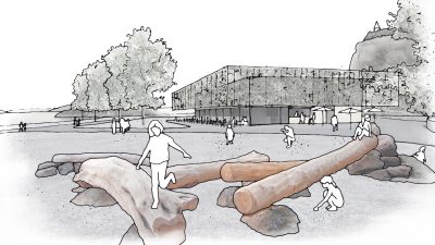
The access to restaurants and kiosk is oriented towards the city centre of Überlingen and the neighbouring playing areas. The offshore kiosk users can enjoy additional seating and an optimal overview of the adjacent playground. The building also opens to the west and north, creating further points of contact. From the interior and the outside terrace, the view expands to the impressive Molasse rock. At the same time, a glimpse from the outside into the dining area is also possible, inviting passing cyclists to rest.
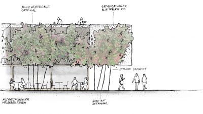
All outdoor terraces and entrance zones are shaded by a vertical green roof construction and horizontal awnings. This space-shaping structure, which adapts to the seasons, envelops the entire building and gives the pavilion a distinctive architectural expression. The integration of the roof surface into the overall design of the pavilion also reacts to the exposed, and easily visible location below the Molasse rock.
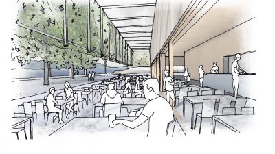
All service functions are housed in a compactly organised core, to which the generously glazed guest room is attached. Due to its elongated proportions, all seats can be placed directly on the front, facing the lake. The deliveries to the kitchen come directly from the outside. Since it is planned to use areas on the neighbouring property of the railway for the storage of waste, the storage areas within the building could be reduced.
The sanitary and staff rooms are located upstairs, whereby the footprint of the building could be kept as small as possible. Through a separate external access, the public toilets can be reached independently. Intelligently scaled room heights make it possible to optimally use the space above the lower side rooms on the ground floor. Due to the weather-dependency, the building is also designed to adapt to different visitor volumes. By flexible partitions, the guest room can be separated into different areas. It is also possible to create a separate room for groups and parties. While the open spaces are used in the summer months, the internal areas and staffing levels can be reduced to a minimum on low-visitor days, without losing attractiveness. The kiosk also “docks” directly to the kitchen and the restaurant counter, creating additional synergies. Taken together, this provides the best possible basis for running the building 365 days a year.
During the Landesgartenschau, the guest room of the pavilion will be used as an exhibition space. The building is supplemented by temporary room modules to accommodate the Landesgartenschau gastronomy offerings. The kitchen and storage areas of the permanent building can already be fully used by the catering industry. Through a covered walkway, a threshold-free connection to the extension is created, which accommodates both an extended kitchen area for the finishing and serving of food, and an entire guest room. The outdoor seating area is extended by the use of temporary timber grates.
The combination of the pavilion and the garden show gastronomy into an architectural ensemble, with multiple spatial references to the inside and outside, creating functional synergies as well as a clearly defined structural situation, which gives an idea of the character. Due to the spatial formation of clearly readable accesses on the east, north and south side, we also connect the building ensemble directly to the planned circular route during the Landesgartenschau.
The plaza around the pavilion is designed as a coherent, island-like area that takes up the organic design language of the park. According to the material concept of the park, this hard facing is to be made with aggregates from the local Molasse Rock. The building is designed as a sustainable timber construction with ecological materials and good thermal insulation properties. The building and the interior surfaces are clad in a simple timber facade. The dining rooms are generously glazed and the sliding doors allow the interior to be opened over a large area to the terrace in the summer months.
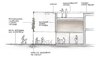
A column-free suspended filigree steel construction envelops the entire structure. This is covered with a permeable rope net, which also serves as a climbing aid for climbing plants and as a space-forming element. The light and transparent construction is a design element and at the same time offers views of the timber facade of the gastronomic pavilion. The density of planting is playful and controllable depending on the situation. There are both densely planted and sparsely planted areas. Through different types of plants selective colour accents can be created. At different seasons there is a changing picture. Denser vegetation in the summer ensures a pleasant shading of the terraces, while the winter vegetation allows more direct sunlight into the space. Through this “natural filter” the building enters into dialogue with the surrounding park. In its materiality, the pavilion supports the ecological values aimed at by the Landesgartenschau and creates an identity-forming meeting place in the central area of the new Bürgerpark.
The facade greenery with climbing plants is a technique used since the beginning of the architecture. It has many regional features and can be successfully applied to almost all facades with relatively little time. The shading, which is achieved by a green pergola, is also very pleasant. A better micro-climate is crated, caused by the evaporation process of the plants.
For the greening of the surrounding vertical screen in this project ground-based climbing plants, a combination of wild grape, clematis and wisteria is proposed. The advantage of the climbing plants lies in their manageable care and the relatively low cost. The MFO Park project in Zurich has already tested various types of climbing plants, which gives them the reliability of a suitable choice of species. In various other research projects (Berlin-Adlersdorf, Paul-Lincke-Ufer Berlin), the growth behaviour of climbing plants has now been extensively observed, so that care costs and growth behaviour are predictable.
The ground-based facade greening is rooted in a generously sized bed. In order to keep its surface minimal, it is designed in accordance with guideline FLL as a two-part tree bed with a substructure of well rooted and buildable substrate. A technical irrigation system is not necessary as the gardener can work with surface waters and initial developmental care.
The climbing aids are made of sturdy stainless steel nets which fulfil the requirement for a durable and low-maintenance solution, and they can ensures that the growth (1m per year for wisteria) can also be directed and managed across the facade. The system includes a recharge facility to compensate for the stresses caused by the plants. The roof area is extensively green (possibly with an integrated roof terrace). The outside seating area can also be individually shaded with an electrically controlled awning.
The typical climbing plants such as wild grape are very low maintenance. However, some horticultural work should be taken into account. It is likely that the plant screen will be processed once or twice a year (pruning, removal of deadwood). For the background of the gastro-island, a permeable and loadable surface is provided, which is colour-coordinated with the neighbouring Molasse Rock. This can be easily transported by the appropriate work vehicles for maintenance of the plant screen.
Similar to the project Swiss Re in Munich, the growth of the plants is managed by annual pruning in the lower areas of branches, freeing new growth, so that in this area a broad view of the lake is possible. In the upper area, the truss structure will transform over time into a lush foliage umbrella.
The climbers can be ordered from the appropriate retailer in a height of up to 4.5 m. With a timely reservation in the spring, the plants could already have reached a height of 5.5 m and a width of about 70 cm by the beginning of the Landesgartenschau. Therefore, the garden show would mark the starting point of the growth process. The support structure would still be visible. The plants are already spreading in the lower areas of the netting. It already offers a diverse picture. The net structure forms a blank canvas for the landscape artist, who creates an ever-changing picture from the palette of flowers.
The concept for the pavilion offers a variety of design options and flexibility in the further planning process. Of the possible design variants, two options have been worked out. Variation 1 is the revision of the previous simple concept, in which the kitchen is organised on one level. Variant 2 shows the maximum equipment with roof terrace and elevator. Between these two possibilities, the design offers numerous options to respond to user requests.
In the revision, the diver’s room was moved to the ground floor for this variant. In addition, a second accessible WC is offered near the kiosk, as well as an additional room that can be used as a changing room. There is enough space for people with limited mobility and for parents with small children. An extended range of sanitary facilities is still on the 1st floor. The kitchen works optimally organised on one level. The roof is extensively landscaped and not accessible.
Option 2 takes into account the wish of the selection committee for a gastronomically usable roof terrace. Critical here, however, is to question whether this extended gastronomic offering can be economically managed. The roof terrace can be accessed with the help of a lift. The diving changing room and all public sanitary areas are located on the ground floor and can be accessed from the outside regardless of the gastronomy. In return, some storage areas were moved to the 1st floor, which are now connected by elevator to the kitchen. The elevator serves service purposes, but can also be used on request by people with reduced mobility to reach the roof terrace. The roof will normally be accessed either via an outside staircase integrated into the canopy or from the dining room via the internal staircase. The area above the gastronomy is formed on the roof as a walk-in roof terrace, the surfaces over the kitchen and adjoining rooms are extensively landscaped.
