Project Information
DI Thomas Horejschi
DI Wolfgang Schwarzmann
DI Thomas Fußenegger
Ing. Benjamin Baumgartl
Arch. DI Roland Wehinger
Client
Caritas, Salzburg & Röm. Kath. Pfarrgemeinde Salzburg - Herrnau, Salzburg
Location
Salzburg-Herrnau (A)
Competition
2015
Projektphasen
Implementaion
Rights
Text HK Architekten,
Translation Bronwen Rolls
Image Thomas Knapp
Caritas Head Office, Salzburg-Herrnau
1st place
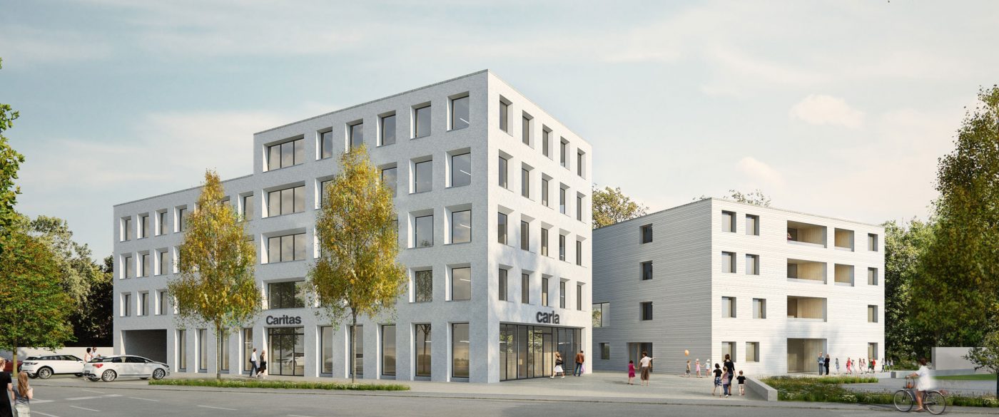
The existing monastery wall was breached on the north-west side, and was supplemented with two new buildings creating gateways for the social centre. The kindergarten and the administration building open the church garden to the general public. The spatial demarcation of the monastery and the parish garden are still preserved.
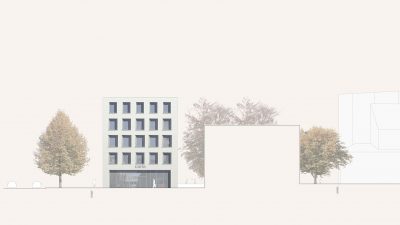
The southern foothills of the city of Salzburg are characterised by dense residential areas. Taking this into account the space is separated over two volumes. The buildings, which are kept minimalist in their outward appearance, subtly blend into the surrounding urban context. Moving away from the church, they give them enough room to do justice to their distinctive architecture. The straightforward office building allows for a buffer zone to the street. This meeting zone forms the connection for traffic and as an extended access area for administration, CARLA and kindergarten. Central to this square is the expanded access to the footpath and to a patch of the trees, forming an avenue along Friedensstraße. The required parking spaces for the shop and kindergarten are placed in front of the administrative building. Their position was chosen so that at a later date a connection to the planned roundabout, the direct exit from the underground car park, can be instigated.
The two volumes are clearly separated above ground. The administrative building requires different room heights to the kindergarten or flats and this allows for an economic use of cubature. Given the surrounding buildings and the required compact design, the space program was organised on 4 or 5 levels. The shared underground car park enables synergies between building infrastructure technologies and parking spaces.
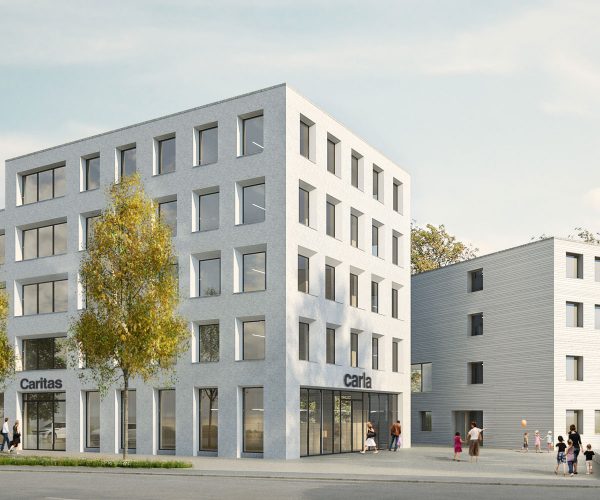
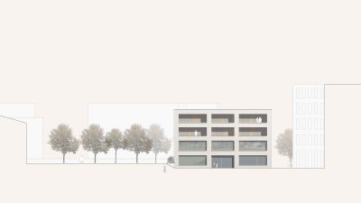
The monolithic administration building is structured clearly and pragmatically. Up to the eastern wall of the plot, it forms the connection area for a planned extension to the monastery. Facade and floor plan have been suitably adapted to use as an office. The bevelled window reveals loosen up the strict structure and allow a high level of daylight in. Generous openings on the ground floor allow inquisitive passers-by to gain insights and lead the way to the fully glazed entrance area. The access to the main building is central. A second back entrance allows protected access to the social care offices.
The central backbone of the office building includes all infrastructural facilities and can be subsequently extended accordingly. The copy room and the tea kitchen are located in central locations so that employees can have an informal exchange during their day. Individual departments are divided with glass elements. The privacy of the workstations can be controlled individually via curtains. With appropriate interfaces, the spatial separation possibilities are massive. Building loads are removed via the core or the outer walls, which means that rooms can be flexibly designed for later uses.
The OG4, with its elevated position, is the ideal location for retreat and relaxation areas. Meeting room and kitchen were planned in close proximity to each other and can be brought together on appropriate occasions. Together with the adjoining green space, the meditation room in the southwestern corner of the building forms a secluded unit of tranquillity. All rooms in OG4 were kept in the grid of the underlying office space. A later extension beyond the roof terrace can be carried out without any significant demolition measures.
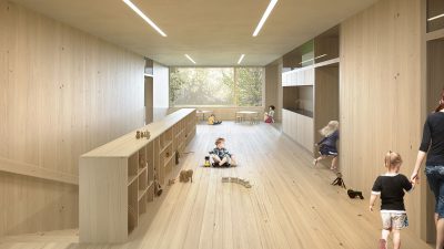
The kindergarten and residential building is open and playful in its design. The building, which was designed as a hybrid construction, includes a support structure made of reinforced concrete with suspended timber elements as the facade. The white paint groups the buildings together, creating an ensemble. The kindergarten is located on the ground floor and first floor. This division ensures a compact footprint and allows exciting visual relationships, both in the rectory garden and in the playing areas. If necessary, the toddler group on the 1st floor can also be extended into a kindergarten group. In the planning the required exposure area, as well as the arrangement of the sanitary rooms, were already considered. The outdoor area is accessed via a porch. The accessibility of the 1st floor is via its own secure access from the apartment staircase. The apartments were distributed in the specified key from 6 – 2 – 1. They are all oriented southeast or northwest. They are accessed via a central core, which is also used by kindergarten as a 2nd escape route.
