Project Information
Builder-Owner
Gemeinde Düns
Location
Düns (A)
Competition
2016
Project facts
Rights
Text Hermann Kaufmann + Partner ZT GmbH,
Translation Bronwen Rolls
Image Hermann Kaufmann + Partner ZT GmbH
Dorfhus, Düns
2nd place
From our point of view, the proposed village square can best develop in the area between the church, the parish hall and the existing shop. The buildings are facing each other and from the lined space that is well executed and perceived. The existing building configuration appears harmonious and is reflected in the new design. The new Dorfhus, in particular the many small-scale functions such as the cafe with outdoor area, the hall, the information centre and the doctor, should all base themselves here. For the square, the main entrance of the church is to be included.
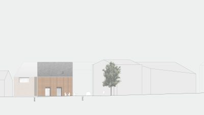
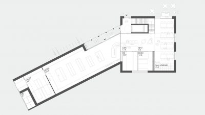
While the “main house” faces the square, the large-scale store is to be accommodated west in its own wing. This lengthways tract is generated by road narrowing and a gate, which marks the western beginning of the actual village square. Here is also a parking area and the delivery point for the store. Through this merger the area to the street, immediately in front of the building, is more usable for pedestrians and cyclists.
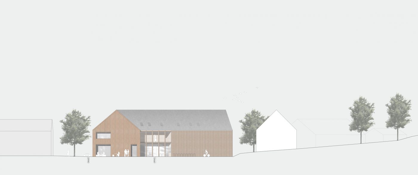
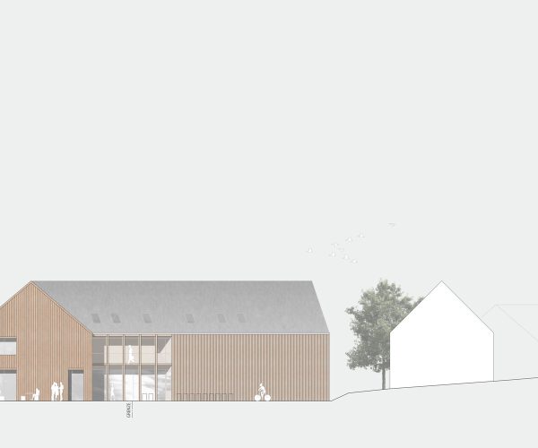
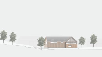
The building itself is oriented to the height of the neighbouring buildings. In order to clearly state that it is “a village hut”, the eaves and ridge heights of the two parts of the building are the same. The language of the facade is also uniform. Nevertheless, the building is divided by the intersection, as well as the dissolved facade in the entrance area of the store.
In order to meet the manifold requirements in a confined space, the new building development is very space-efficient. This creates space for flexibility and saves construction costs. The compact and central access core connects all areas. All stored goods, as well as bicycles, can be quickly and easily transported to the basement via the large elevator. To relieve the stairwell during store opening hours, a direct, covered entrance to the store is provided.
The design maps almost all required criteria with regards to the desired diversity of use on the ground floor. Based on the experience of completed and ongoing projects in collaboration with gastronomy planners, we advise against the leasing of the gastronomy to two tenants due to the small size of the project. An economical operation of the shop and the catering trade can be achieved only if the restaurant remain in “one pair of hands”, so that resources and personnel can be used optimally. Nevertheless, the catering in the present draft can be sublet for events of all kinds, or the store staff can take care of additional guests.
At the heart of this holistic concept is a coherent counter, a welcome desk, for all functional areas with short distances and a good overview. Depending on the time of day or program, one or more people may work together here. The central position is at the intersection of cafe or library and shop. Incoming guests who have rented the hall for a celebration, for example, can be received at this central point by the staff. As a retreat, the office with a meeting table is available.
Cafe and hall are divided into a counter area with bar and a large adjoining area. In normal operation, the whole room is open for reading and dining in a living room atmosphere. The area can be divided almost arbitrarily by mobile partitions. The cafes and outdoor seating niche are all oriented towards the village square. So the “hustle and bustle” can be observed very well from the cafe. The outdoor areas are designed as a small street cafe with trees. For events, the outdoor area can also be extended to the village square if possible.
While the store has its own warehouse, all other storage and cellar areas, as well as the toilet facilities are housed in the basement. The inhabitants of the apartments arrive with the elevator to the cellar. In the basement a door is planned as a separation to the catering in the night. The storage area of the store is a bit smaller for reasons of space, but seems feasible through adapted delivery management. A fixed place for “rarely needed items” is also provided in the basement.
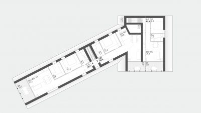
The doctor’s office on the first floor is located directly on the staircase and also oriented towards the village square. The two other serviced apartments are also on this floor. On the second floor, the steep gable was used for spatially exciting first-time buyer apartments.
For the implementation of the Dorfhus a timber construction, made of load-bearing solid timber walls, is proposed. In addition, there is wool insulation and a vertical rough-sawn facade.
This makes sense in many ways. This construction is particularly ecological and sustainable. In addition, timber is readily available in the community, and the physiological and atmospheric quality of the timber fit in perfectly in the village centre. With this diffusion-open design, with high insulation and heat storage capacity, it must be checked in the project development whether controlled ventilation for the apartments can or cannot be dispensed with. With the demand for more craftsmanship and low-tech instead of high-tech, very good results in terms of energy efficiency and living comfort can be achieved here.
The facade structure, with the wide boards and the massive visible timber supports, express this “massive building” to the outside and is also a small reminder of the existing property.
The dissolved facade areas at the entrance to the shop and at the gables divide the building structure, but also create an exciting combination of large-scale lighting, while at the same time preserving the natural and finely structured character of the entire building.
